
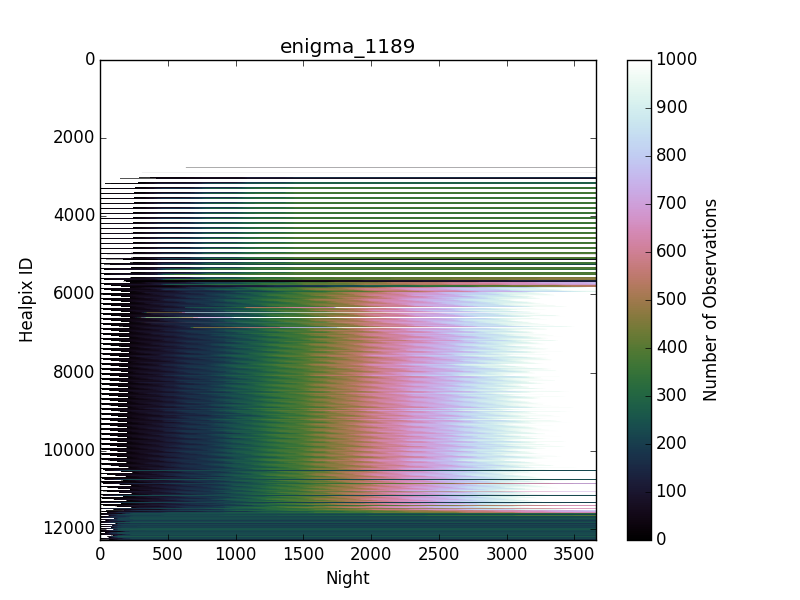
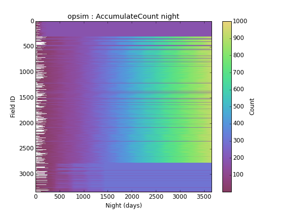
I started playing with a new way to visualize OpSim runs. Here’s a plot showing how many times a spot in the sky has been observed as a function of time. Normally, we just make Aitoff plots of various values at the end of the survey, but that doesn’t help if one wants to see the time-evolution. Basically, I’ve sacrificed displaying one of the spatial dimensions in favor of time here.
Some of the interesting things you can see:
- Large blue region at the top = outside the survey.
- region around healpix ID 4000 = North Ecliptic Spur. You can see it bumps up seasonally, and stops getting more visits after ~year 3.
- The big rainbow is the wide-fast-deep main survey.
- You can pick out a few of the deep drilling fields
- at the bottom, the South Pole gets observed less and completes early.
My hope is that plots like this might be a better way of doing quick visual Q&A on OpSim runs, rather than wade through lots of sky maps. And of course other things can be computed and presented like this as well (seeing, coadded depth, etc).
Comments welcome.


 We have indeed swapped over to perceptual_rainbow.