Awesome. I have some more feedback on this.
In general I’m wondering if we can shorten the text in each bullet and still have it make sense. Proposals below. But perhaps in the real formatting there will be more space per line.
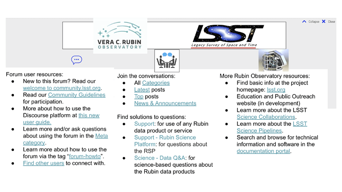
Forum user resources:
I added a placeholder for the user tutorial post that @ChristinaAdair and I are working on.
I think “Find other users to connect with” might fit better under “Join the conversation”? Also perhaps we could add the EDI category to “Join the conversations”…
In addition to shortening bullet text, there are a few more categories we could highlight in the “solutions to questions” list? Example below.
Find solutions to your questions about:
And then here’s an attempt to shorten the bullet text for the external links.
External resources (links out of the forum):
I’d also like to add some kind of mission statement or catch phrase in a central area banner, like:
“This Community Forum is the main portal for community engagement and crowd-sourced support for science with the Rubin Observatory data products and services. Everyone is welcome to browse the contents, ask questions, share knowledge, and discuss topics related to Rubin Observatory and the Legacy Survey of Space and Time (LSST).”

