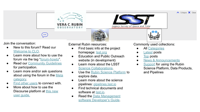
As part of the Community Engagement Team’s efforts to improve this forum, we propose the addition of a banner that is always visible at the top of the screen. This will not only improve the aesthetics of the forum, but will make it easier for new visitors (or those who haven’t visited for a long time) to quickly understand the purpose of the site, and to readily navigate to frequently visited topics on the forum, and related external resources. An example of the type of banner we are considering can be seen at this Unbounce forum – notice that the banner can be expanded or collapsed by clicking on the button at the top.
Once we have decided on the content to include in a banner, we will have our fantastic graphic art wizards create something aesthetically pleasing and in keeping with the Rubin visual style. In the meantime, I have created (and attached) a mock-up to promote discussion. Try not to get distracted by the visual elements – the purpose of this mock-up is to gather feedback about the contents that we would want to have in the three columns below the logos/images (or whether we want/need three columns, or two, or eight).
In the current mock-up, the left column is meant to provide resources to unfamiliar users to find help related to using the forum itself. The middle column links to external Rubin Obs. resources. The right column provides links to commonly-used collections of topics as a convenience for navigation.
Before we proceed to the final design – do you have thoughts about the proposed contents of a navigational banner for this forum? [NOTE: the links are clickable in the attached PDF (but not in the PNG that you see previewed in this topic).]
CLO_banner_mockup.pdf (975.4 KB)
